
Luiz Rafael Andrade, Catarina Brandão and António Pedro Costa
Qualitative data include journal articles (in the case of systematic reviews), individual and group interviews, focus groups, questionnaire surveys, social networks, videos, images, among others. Qualitative variables represent information that identifies a quality, category or characteristic that is not measurable but can be classified. So, it is easy to understand how data visualisation and outputs may be a valuable resource for qualitative researchers.
Most researchers and readers have probably heard of data visualisation (visual outputs). Visual representation is helpful during all phases of data analysis. These allow identifying patterns, numerical and non-numerical trends, using graphs, maps, tables, diagrams, flowcharts, among others. Some examples of visual outputs of qualitative data (unstructured and non-numerical data) will be presented in this context.
It can be said that the visual output concentrates and synthesises a quantity of data facilitating the explanation for the readers. Depending on the study phase, the researcher may use visual outcomes at different stages of their research. You can break down the use of visual outputs to:
- exploration or gaining insights: an initial exploration of the data often referred to as pre-analysis;
- data interpretation or inference: categorisation and coding of data for interpretation and inference;
- to report, share and discuss results: synthesis of results for explanation and discussion.
Why use visual outputs in qualitative analysis?
Using this type of representation allows the reader to analyse something else; it helps break down the data/results in a text. Nicolas Payette and Christopher Watts (2016) defend that articles must have quality and be sexy. Sexy articles attract more readers; more readers increase the number of citations, which boosts the authors’ work, and the rate increases the chances of being accepted and published. The use of visual representations can make a scientific text more appealing.
A visual representation of data has, if explained and understood, the possibility of stimulating the discovery of new knowledge through its interpretation. Data visualisation can also bring the potential for collaboration in discovering further information. In this sense, the graphic can be rich in information, but it is still a poor resource if the author does not explain to the reader what it presents/represents. Next, we offer eleven examples of visual outputs explored through qualitative data. We organise these examples considering the different stages of a research project where each visual output may be helpful.
The use of visual representations in the qualitative data organisation phase
When visualising qualitative data, it is essential to consider that visual representation is not only helpful when publishing a text or presenting data to a specific audience.
It is essential that the researcher obtains and has access to visualise their qualitative data already in the phase of organising their sources, since the representations also have the potential to contribute so that, for example, the analysis categories, sources and classifications are better visualised and represented during and after the execution of the research project.
Below, we present some examples of various visual representations, starting with two possibilities for exploring the data, even when the researcher has not yet started the analysis and coding work. Subsequent visual representations can benefit qualitative data exploration and the organisation phase.
1. Word Cloud
A word cloud is a visual representation of word frequency. It is used to highlight how often a specific term or category appears in a data source (e.g., text). The more times a word appears in a font or multiple fonts, the more highlighted/more significant the word will be. Word clouds are used to gain immediate insights into the most critical terms in the data. Tag clouds can, for example, help you visualise how customers feel about your products or the basketball players who scored the most points in a given game.

Source: webqda.net
2. Word Tree
The Word Tree is an interactive visual representation to show the different contexts and, quickly, display the result of exploring the data of a particular word chosen by the user. It allows you to contextualise what is being written around a specific topic. The graphics part processes the list of contexts from the sentence view and presents them in a more horizontally structured way. The Word Tree complements the word cloud, which gives an overview of the most frequent terms but does not reflect their context in the use of specific phrases/expressions. It is possible from executing a word tree to select other words. In addition, word length varies depending on the number of occurrences.

Source: webqda.net
3. Tree Map
A treemap provides a hierarchical view of coded data and makes it easier to identify patterns. Rectangles represent tree branches, and each sub-branch is shown as a smaller rectangle. The treemap chart displays categories by colour and proximity. In the below example, the category “Fonte Interna” is represented in red; “Códigos arvore” is a different category and is represented in green. This output type can easily display large and small amounts of data, which would be difficult with other chart types. Treemap charts are suitable for comparing proportions within the hierarchy; however, they are not as effective for showing the hierarchical levels between more significant categories and each data point.

Source: webqda.net
4. Bubble Chart
The area of each circle is proportional to its value (here, the file/document size). While nested circles do not use space as efficiently as a treemap, “wasted” space better reveals the hierarchical structure.
This graph can visually represent the coding system data, both free and tree codes. Solid and soft colours can be used to describe each level of code. The inner and smaller circle represents the main (parent) code, the successor circle and more significant than the previous one, the secondary codes, the next circle, larger in size than the previous one, above, the tertiary ones, and so on. The complete circle represents the outermost code division until all hierarchical code levels are completed.
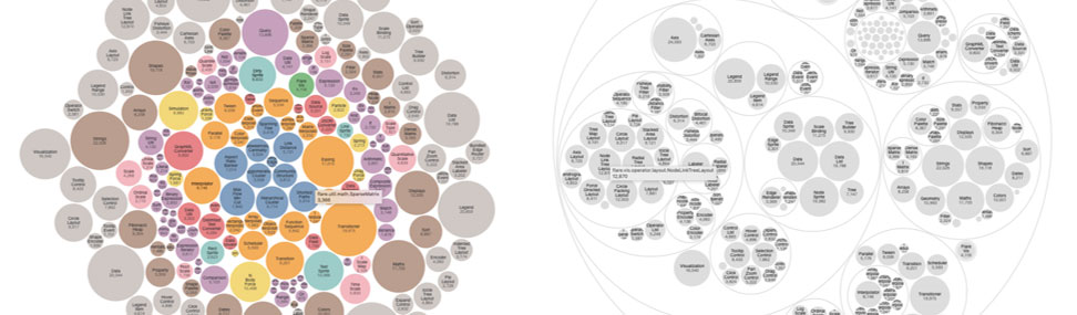
Source: observablehq.com
5. Sunburst Chart
A sunburst chart visualises hierarchical data, represented by concentric circles. A sunburst chart without any hierarchical data (i.e., when we only have a level of categories) is similar to a doughnut chart. However, a sunburst chart with multiple categories shows how the outer rings relate to the inner rings.
The sunburst chart is ideal for displaying hierarchical data. Each hierarchy level is represented by a ring or circle, with the innermost circle at the top of the hierarchy. This graph is most efficient in showing how a crew breaks down into its constituent parts.

Source: webqda.net
Final considerations
If generated in the data organisation phase, visual representations are relevant as they directly contribute to the description of the research’s methodological procedures. In this sense, the outputs can present a visual overview of the work in progress for the qualitative researcher and allow this professional to have more than one visual option to communicate the structuring of their research with transparency and scientific rigour.
Bibliography
Costa, A. P., Moreira, A., & Souza, F. N. de. (2019). webQDA – Qualitative Data Analysis (3.1). University of Aveiro and MicroIO. www.webqda.net
Eyenike, T. (2022). Data Visualization Using Chart.js and Gatsby. https://hackernoon.com/data-visualization-using-chartjs-and-gatsby
Google. (2021). Using Google Charts. https://developers.google.com/chart/interactive/docs
Long, A. (2017). Popular Techniques for Visualizing Qualitative Data. LinkedIn. https://www.linkedin.com/pulse/popular-techniques-visualizing-qualitative-data-adam-long/
Payette, N., & Watts, C. (2016). Quality versus Sexiness: The rival qualities of papers in the competition for academics’ attention. Share by PEERE. http://www.peere.org/wp-content/uploads/2016/03/Quality-versus-Sexiness_CW.pdf
Related Products